Website creation
What should a professional website include?
A professional website is not defined by its appearance alone. It should help visitors understand the project and find the information they need, and then see what the next step might be. Design matters, but it needs to work together with the structure, the content, the speed and the experience on mobile.
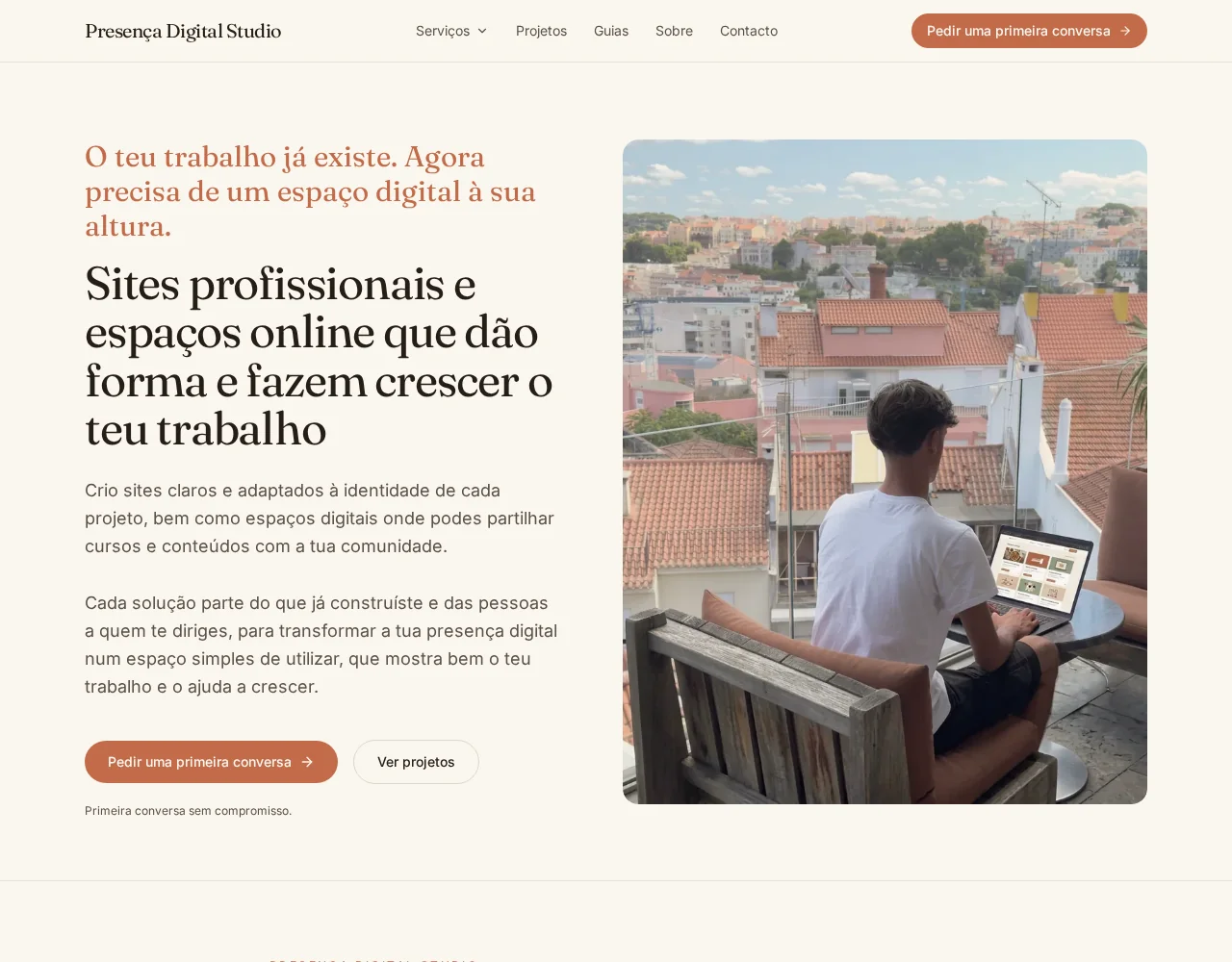
How can you tell whether a website explains the project clearly?
Someone visiting the website for the first time should be able to understand, within a few seconds, who is behind the project and what work is presented there. They should also be able to recognise whether it is relevant to them.
This does not mean the top of the page has to be cold or overly commercial. A more human sentence can be part of the identity, but it should not completely replace a concrete explanation of the service.
The hero should combine enough context to guide people who do not yet know the project with a clear next step. That step might be exploring the services, visiting the projects, looking at an activity or getting in touch.
Which pages should a professional website have?
The structure depends on the type of project. Not every website needs the same number of pages.
An independent professional may need a homepage, an about page, a services page and a contact area. An accommodation business may need pages for rooms, location, terms and bookings. A training project may need to organise courses, a calendar, resources and access to a platform.
The aim is to distribute the information logically rather than to create lots of pages, without hiding important content or making visitors work through an overly long menu.
What should appear on the homepage?
The homepage should present the project and its main offers, letting visitors choose where they want to go next.
It can include an introduction, the most important services or activities, a short presentation of the person or team, a few projects and an invitation to get in touch.
The homepage does not need to contain every detail. It should work as a map that helps people find the right pages.
How should the text on a website be written?
The text should answer the questions people genuinely ask before getting in touch or buying.
It is important to explain:
- what is being presented;
- who it is for;
- how it works;
- what is included;
- where it takes place;
- what the next step is.
Inspirational phrases can be part of the identity, but they should not take the place of practical information.
Paragraphs should be easy to read and subheadings should help people move through the page. No idea needs to be repeated just to fill space.
How can you convey trust without overdoing it?
Trust comes mainly from clarity and consistency.
A website can present:
- the person or team;
- the approach;
- relevant training;
- the way of working;
- completed projects;
- testimonials shared with permission;
- terms of service;
- genuine ways to get in touch.
Clients, results, figures or qualifications should never be invented. It is also important to avoid absolute promises, especially in areas related to health, support, education and personal development.
Does the website need to work well on mobile?
Yes. A significant share of people arrive on a mobile phone, especially when they are looking for contact details, a location, a booking or quick information.
Shrinking the desktop version is not enough.
On mobile, the following should be reviewed:
- menu;
- text size;
- paragraph width;
- buttons;
- forms;
- galleries;
- tables;
- spacing between sections;
- fixed elements;
- loading speed.
Nothing should be cut off or overlapping, nor too small to tap.
What makes a website slow?
The most common causes include heavy images, videos that load automatically, excessive animations, unnecessary fonts and poorly configured external integrations.
Photographs should be used at the right size and in optimised formats. Elements that only appear further down the page can be loaded as the person approaches them.
Speed should not be improved at the cost of removing important content, but every element should have a real purpose.
What ways to get in touch should there be?
The way to get in touch should match how the professional or project actually works.
Options may include:
- a form;
- email;
- phone;
- a business WhatsApp account;
- a booking calendar;
- a reservation system;
- registration for an activity;
- a request for a proposal.
What matters most is that the path is simple and that every button leads somewhere that works.
A website should not offer five different ways to get in touch just to look complete.
What does a website need in order to appear on Google?
The website should allow search engines to find its pages and understand their content.
A technical SEO foundation includes:
- a unique title for each page;
- a meta description;
- a clear H1;
- well-organised subheadings;
- simple URLs;
- alternative text on images;
- internal links;
- a sitemap;
- a canonical tag;
- no unintended blocking;
- a good mobile experience.
This foundation does not guarantee first place on Google. Visibility grows with the quality of the content, the relevance of the pages, the projects published, external references and ongoing work.
Do you need a privacy policy?
Whenever the website collects data through forms, newsletters, payments, bookings or analytics tools, it should explain what information is collected and what it is used for.
The privacy policy should reflect how the website actually works.
It should not mention tools that are not used, nor copy legal texts from other projects without adapting them.
Does a professional website have to be large?
No.
A small website can be professional when it presents the right information and guides visitors well.
It is better to start with a simpler, coherent structure than to publish lots of empty or outdated pages.
As the project grows, the architecture can be prepared to take on new content and features.
How can you assess a website before publishing it?
Before publishing, it is important to check:
- whether the opening message is clear;
- whether the menu works;
- whether every button leads somewhere;
- whether the form sends correctly;
- whether the website is adapted to mobile;
- whether the images load;
- whether the text is free of errors;
- whether there are SEO titles and descriptions;
- whether the important pages can be indexed;
- whether the legal information matches how the website works.
It is also useful to ask someone who does not know the project to carry out a simple task, such as finding a service or getting in touch. The difficulties they run into can reveal problems that are no longer visible to whoever created the website.
Conclusion
A professional website should explain the project clearly and let each person find what they need without effort. That is where trust comes from.
The best structure respects the identity of the project and works simply for the people who use it, even if it is not the largest or the most sophisticated.
About the author
Gaspar creates websites and digital spaces through Presença Digital Studio, aiming to organise each project with care and with attention to the way people use it.
Get to know Presença Digital StudioRelated articles
- Como preparar o teu projeto antes de criar um siteAvailable in Portuguese
- Quanto custa criar um site profissional em Portugal?Available in Portuguese
- Essential Website, professional website, app or platform: which should you choose?